
cool compositions in 2d Design
Line dynamics
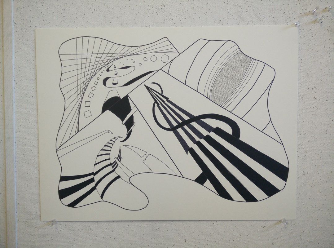
The goal of this project was to create depth using only lines in four unique quadrants of the illustration board. This project was initially very challenging for me. It was difficult to visualize ways of getting lines back into space while also being detailed and visually pleasing. My first step was to create an interesting organic shape that would be visually striking for the boundary of the entire piece. Once this was done, the challenge was to create four diverse, but equally appealing, quadrants of lines going back into space. Because I lack experience in drawing, it was difficult to get the images from my mind onto the illustration board. I quickly realized that clever use of vanishing points and straight lines made the process much easier than I thought. Because of this, the hardest part then became thinking of what to even draw in the first place. I overcame this obstacle by looking at other line illustrations and by sketching different ideas out. When I finished laying everything down, I inked everything in with sharpies and Copic multiliners. This combinations allowed for very rich blacks, and also an atmospheric effect could be created with the different colors of black made by sharpies and copics.
Shape transformation
The goal of this project was to transform inorganic shapes into organic shapes in five logical steps. This project was very fun for me because I was able to use my computer to complete it. I started the creative process by thinking of two shapes that would easily interact and engage with each other. Once I had the square and the rectangle, I made the transformation by moving, dragging, and adding anchor points to the shapes in Adobe Illustrator. Because of how I did this project digitally, I could freely manipulate the objects and try out different ideas without fear of ruining the project. I tried many ideas and simply "undid" any change that was not working the way I wanted it to. This led to the project evolving as it was created, similar to how the shape evolved in the finished piece.
Balancing act
PRELIMINARY SKETCHES


END PROJECT


The goal of this project was to showcase stability, individuality, dominance, and opposition using only four squares and a circle in each image. This project was really entertaining and interesting to me, because like the previous assignment, I was able to use my computer to complete it. This allowed for my craft to be exceptionally high, with deep, even blacks, and perfectly even shapes and lines. I am really pleased with how all of the different frames turned out, and I do not really have a favorite out of them. When I was completing this project, I kept trying to make each picture clearly represent the intended element without any place for confusion. Being restricted to only using four squares and one circle per image helped with this, because it prevented the compositions from becoming overly complex. Overall, I really enjoyed this project and I hope that it serves to showcase the different elements intended.
Nature project
PRELIMINARY SKETCHES


END PROJECT


This project required me to take a natural object from outside somewhere, and then abstract it into something completely different. This was quite challenging for me to do, because I instinctively did not want to lose the shape of the object in my abstractions. Specifically, my object was a leaf, and it was hard for me to stray away from the form of a leaf. I felt that if I created something that failed to resemble a leaf, then I would be creating a random object that was not the assignment. This was the biggest challenge for me, as you can see that my two abstractions highly resemble the leaf. For the last part of the assignment, which was to cut and re-assemble the abstractions into something even more abstract, I was challenged because I had to create something out of many shapes that were very similar to each other in shape and size. I ended up creating a debris field of floating parts. I really was pleased with this, because it appeared as if the pieces are all floating and swirling around each other, and then going off into the distance in four focal points near the corners. Overall, I did not like this project as much as I enjoyed some of the others, but it turned out cool nonetheless and got me thinking about how to abstract an object.
pattern saturation
WORK IN PROGRESS


END PROJECT


The goal of this project was to design a shape, cut it out, and use it as a stencil to create almost random shapes on the picture plain. Then, using the shapes and lines from the stencil, I erased different lines as I saw fit to create unique shapes that all originated from the stencil. Once 7-13 different shapes were on the paper, a pattern was to be designed in each shape to create a composition that showed high variety, and also created depth and overlap on the 2D plane. I really enjoyed this project because it allowed for a high level of creativity within the piece. I really could do whatever I wanted, and I did. I chose to create highly compact, geometric patterns that added visual density to the composition. The part that I struggled with the most on this assignment was creating consistent and even patterns. For example, a pattern that contains many straight lines is hard to do by hand, and using a ruler is simply not practical because of how long it would take to achieve a simple pattern with it. Overall, I really enjoyed this project and I like the way it came out. I had a lot of fun making the patterns and am proud of the end result.
Color theory
COLOR SWATCH: LAKE MICHIGAN
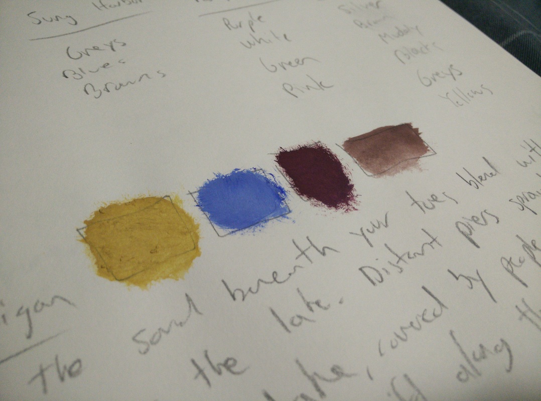
Colors of the sand beneath your toes blend with the sun rising over the lake. Distant piers sprawl out into the great lake, covered by people taking flash photos. Boats and kayaks drift along the moving waters.
Colors (left to right): Sunshine Sand, Moonlit Blue, Rowboat Red, Pier-wood Brown
Colors (left to right): Sunshine Sand, Moonlit Blue, Rowboat Red, Pier-wood Brown
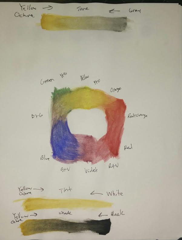
COLOR WHEEL: MAGAZINE CLIPPINGS

COLOR MIXING

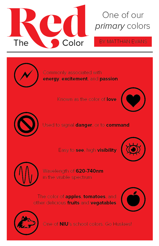
COLOR RESEARCH: RED
OTHER COLORS
Yellow: Color of contrast, high energy, and happiness.
White: Color of purity, hope, and calmness.
Blue: Color of intelligence, comfort, and loyalty.
Orange: Color of adventure, warmth, and creativity.
Gray: Color of neutrality, indecision, and peace.
Brown: Color of protection, familiarity, and hospitality.
Pink: Color of passion, girls, and friendliness.
Violet: Color of fertility, sacredness, frailness.
Green: Color of life, renewal, and growth.
IDEntity/branding
BRAND STUDY/WARM-UP: SPOTIFY


PERSONAL LOGO VARIATIONS


BUSINESS CARD
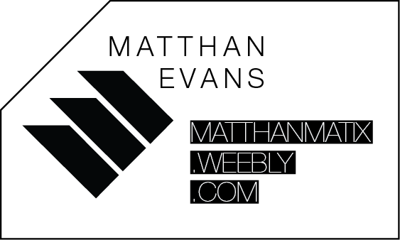
I designed my logo, the three stripes, with my name in the forefront of the design. If you look closely the three stripes can be seen as either a slanted 'M' or a slanted 'E'. These are my initials and that was the main reason that I came up with the three stripe design for my own personal logo. The three stripes are also very clean and ultra modern. There are no unnecessary lines or shapes in my logo--only the most essential objects are used to convey my identity. All together I wanted to design a logo that would clearly represent me, but also be abstract enough to hold its own weight when disconnected from my name and serve as stylish branding.
I used many tools in Adobe Illustrator to create my logo. I used the polygon tool, copy-paste, pen tool, pathfinder tools, grouping, type, and the line tool. There might be a few things that I missed, but those are the primary tools that I used to create my logo.
I used many tools in Adobe Illustrator to create my logo. I used the polygon tool, copy-paste, pen tool, pathfinder tools, grouping, type, and the line tool. There might be a few things that I missed, but those are the primary tools that I used to create my logo.
re-branding cube


This final project was one of my favorite projects from over the whole semester. It allowed me to use my knowledge with visual communication and bring it to the class. Because of this, my project was more simplistic in nature. Rather than being a very complicated collage of random elements from the packaging, I wanted the cube to still be recognized as Converse. I want whoever picks up the cube to instantly know what brand the cube represents. I think that in the end it worked out well. I overlapped all sides of the cube with each other, which was very confusing and hard to wrap my mind around, and created a strong directional force that causes the viewer to turn the cube around in his or her hands in order to take in the whole thing. Overall, I think the project turned out very successful.
